So it was that when I arrived at the university, pleased that I'd managed to get one of the 10 or so parking spaces left, I realised I'd left my laptop at home. I was faced with a terrible dilemma: go back and get it (but lose my parking space) or stay where I was (but have to rework my slides). I chose the latter.
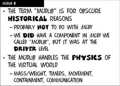
The reason I had to rework my slides is because normally they look like this:
However, if I use the computers in the lecture rooms, they never look like that because they don't have the fonts installed. They look an utter mess. I therefore had to convert all the slides to some other font, and try put in the emphasis somehow.
I tried a handful of standard fonts that even the university's lecture-room PCs would have, and reluctantly decided I'd have to go with Comic Sans. It's not a font I like, but it was the only one available that's remotely in the same vein as my usual COMIX and COMIX HEAVY. Here's the result:
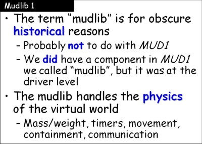
Bleah.
Because Powerpoint didn't have any way to do "replace everything in this font with the same thing in this new font", I had to convert the whole slide set into Comic Sans and then go through emphasising bits separately. Interestingly, most of the time I got the same emphasis as in the original, but there were differences. Here, for example, there's an extra emphasis of "driver" in the original which wasn't in the replacement (the emphasis of "1" in the header line is because the "1" in COMIX looks like "i" and I wanted it to look like "1" so I switched to COMIX HEAVY for it).
Another thing I had to do was change case a lot. One advantage of using an all upper-case font is that you don't have to type capital letters because every letter is a capital letter. However, converting it to a mixed-case font meant I had to capitalise words like "MUD1", which weren't capitalised originally. I also had to decapitalise some letters in COMIX HEAVY terms, because, hmm, well perhaps the best way to explain it is with an example. Here's the same word in COMIX HEAVY twice:
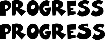
See how the second one has different versions of the letter "S" at the end? The first one is in upper case: COMIX HEAVY may be all capital letters, but it has two versions of the alphabet (one corresponding to upper case letters and one corresponding to lower case letters). I prefer the more disorganised look of the second to the first, so whenever I have a word with the same two letters consecutively, I replace one of them with a capital so they look different — more "written". Unfortunately, this means that when I switch to a mixed-case font, I have to take them all down again.
In the end, it took me over an hour to convert all the slides, but I did quite well — I only missed one switch in capitals and one emphasis that didn't get the blue colour I'd gone with. On the whole, though, I don't think I'll be keen to repeat the exercise any time soon...